Crisp

A tool for turning information from text, files, and web pages into structured data, then letting you work with it as a table, card, or chart.

Role
Product Designer & Full-Stack Developer
Timeline
TBD
Stack
Next.js · Tailwind · Google Gemini · Firecrawl · PostgreSQL (Neon) · Clerk

What Crisp is

Crisp takes information from text, files, and web pages and turns it into structured data. Paste something in, upload a file, or give it a URL. For web pages, Firecrawl retrieves the content and Gemini structures it. Crisp then lets you see the same data as a table, cards, or a chart. V1 focuses on getting the transformation and views right. Editing comes next.

  1. 01

    Web page

  2. 02

    Crisp

  3. 03

    Table / Cards / Chart

Why I built it

The starting point was AI-assisted research: asking questions, comparing information, summarizing pages. Getting an answer was never the hard part. Turning it into something usable afterward was.

My sister ran into the same thing in her own work. She studies history and often collects information from different places online. The information is there, but getting it into a format that's easy to compare or use later still takes a lot of manual work.

AI can already produce the information, but the result usually lives inside whatever conversation made it, harder to find with every message that follows. The structured result needed a place to live outside that thread, somewhere to come back to, not something to scroll past.

Designing for unpredictable data

Making the structured result the thing people work with created a different problem: the data itself was impossible to predict in advance.

Product comparison

4 fields · 12 rows

Job listings

9 fields · 50 rows

Research notes

3 fields · long text

The fields, value lengths, result count, and data types could all change from one input to the next.

The challenge was making very different datasets behave like the same product.

What can changeWhat stays consistent
415 fieldsSame hierarchy
Shortlong valuesSame spacing rules
TextnumberstatusSame data-type treatment
MissingpopulatedPredictable fallback
150 resultsSame layout behavior

StatusStatus indicator + dot

CategoryAccent-colored chip

NumberRight-aligned value

DateFormatted text

Missing valueEm dash

Building the system

Components share the same tokens. Data types determine how each value is presented across the system. The same rules carry across all three views. The view changes. The data doesn't.

  1. 01

    Foundations

  2. 02

    Tokens

  3. 03

    Components

  4. 04

    Data types

  5. 05

    Views

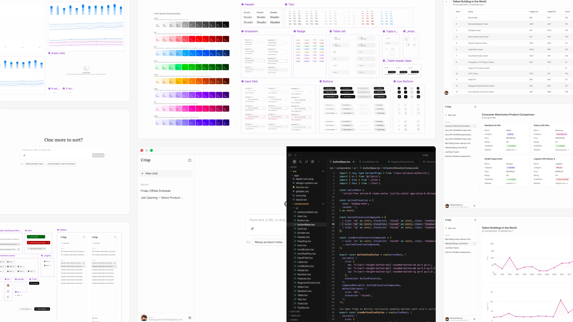
Crisp design system: color, type, inputs, and buttons
Crisp chart components, axes, and empty state
Crisp app components including sidebar, alerts, and cards

Putting the rules to work

Table

Table columns size themselves from the actual content, never below what a chip needs to stay whole, and cap their growth once every column is comfortably sized rather than stretching to fill the entire screen. The header stays fixed while rows scroll underneath it, and content wider than the available space scrolls horizontally instead of being compressed.

Cards

Cards had to work across very different amounts of content. The structure stayed consistent (title, key/value fields, optional long-text section) while the content determined how each part behaves.

A Crisp card with three fields
A Crisp card with fifteen fields
A Crisp card with a long-text section
Several Crisp cards in a bounded layout

Charts

Charts are chosen from the shape of the data rather than by asking the user to pick one. The supported cases stayed small on purpose: better to make a few behave reliably than generate a chart for every possible combination.

Data shapeChart
Date + NumberLine
Category + NumberBar
Comparable numeric fieldsMulti-series
Different scalesSeparate charts
The same dataset shown as a table
Table
The same dataset shown as cards
Cards
The same dataset shown as a chart
Chart

When real data broke the rules

Anything that looked numeric got charted, whether it should have been or not. In one result, a text field was pulled into the chart as a number, producing a value with no meaningful interpretation. The problem was treating "numeric" as synonymous with "chartable." A number can be valid data without being meaningful in a chart. Fix: chartability became a separate decision from data type. Crisp only creates a chart when the selected fields have a meaningful relationship.

Crisp charting a Product field as a number, with an arbitrary negative value

Card width was implicit instead of explicit.

A single card would stretch across the entire result area, since width was being derived from how many cards happened to be on screen, and a lone card had nothing to size itself against. Fix: card width is now a fixed constraint, applied the same way whether there's one card or twenty.

Design ↔ Code

There was no Figma-to-development handoff. I designed and built the system myself. Visual decisions mostly started in Figma. Behavioral rules (how a table fills or scrolls, how wide a card can grow, which fields can share a chart) emerged through implementation and testing with real data.

The behavioral logic wasn't reflected back in Figma. What did flow back was the token layer (colors, spacing values), keeping the design file and shipped product visually consistent.

Figma defined what it looks like. Real data defined what it does.

  1. 01

    Design

  2. 02

    Build

  3. 03

    Test with real data

  4. 04

    Find the problem

  5. 05

    Write the rule

  6. 06

    Code it

Figma components for Crisp
Figma component
The same components implemented in code
Code component
The Wikipedia source page used as messy real-world input
Real data
The structured Crisp result as a chart after refining the messy source
Result

What shipped

Crisp is live, authentication, persistence, account isolation, rate limiting, and URL fetching are all handled too.

What's next: editing, reshaping, saving, and exporting that data.